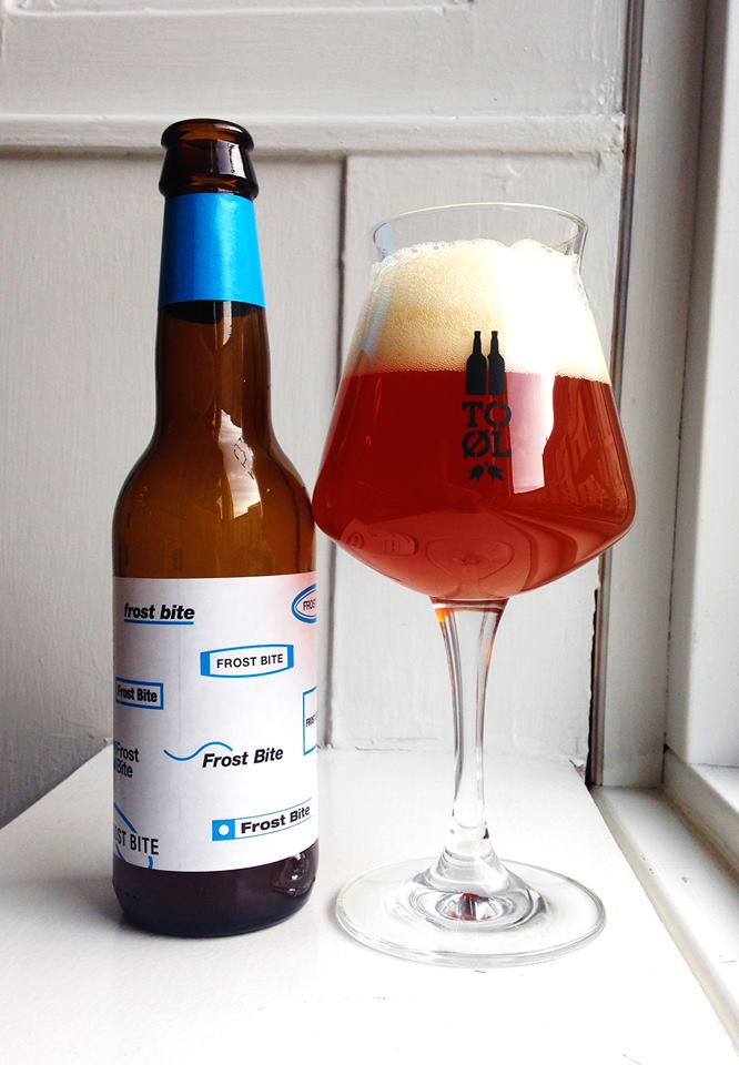
A few questions for Kasper Ledet. Art director and designer for To Øl and their newly established Copenhagen Brewpub Brus. To Øl are famous for their unusual, experimental and sometimes extreme beer and it’s fitting that the artwork and design provided by Kasper is just as unique. On shelves, bottles of To Øl somehow manage to be instantly recognisable without two designs ever looking the same.
When and how did you get involved with To Øl.
Me and the founders of To Øl, Tore and Tobias met while attending the same high school in Copenhagen. The school is actually located only 50 meters from where BRUS is today. Back then I was experimenting a lot with illustration and graphic design. The boys were already brewing together with our chemistry teacher Mikkel (founder of Mikkeller) in the school’s kitchen. When they had to bottle their first home brewed beer they asked me to create the label. I made it using only black so it was easy to reproduce on a xerox machine. When they had to release their first commercial beer in 2010 they called me again and I have been on board ever since.
What are your roles as art director and lead designer?
Everything related to aesthetics within the company. Designing the labels, merchandise and apparel. Bits and pieces, choosing the lamps for the office and being a consultant on aesthetic decisions from a business card to a brew pub.
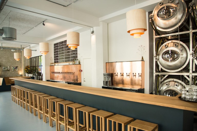
You’re also the art director and designer for BRUS brewpub in Copenhagen. Is it a different challenge working for a bricks and mortar space as opposed to working on branding?
There are definitely different things to be considered when working with a physical space as opposed to the To Øl brand. When designing BRUS we were a team of people collaborating: Furniture designers, carpenters, a light designer, gardeners, the team from To Øl including myself and the manager of BRUS. It was a very exciting way of working. We also wanted BRUS to have it’s own identity and not just be the physical manifestation of To Øl so we tried to do something different.
Are you given free reign on the designs for To Øl or do you work to a brief?
I’m given pretty much free reign. Of course I have to stay within the limits of the legislation of the various countries that we export to. We often discuss the various designs. It is usually a very productive discussion where Tore and Tobias try to make me go all the way with the concepts of the designs. I find this much more stimulating than the usual client / designer situation where you should always make it more “normal” more easy to decipher and make the logo bigger. Our way of working of course requires a great deal of trust but our time in high school together maybe plays it’s part here.
Do you try to have a consistent aesthetic in your work?
It depends on how you interpret “aesthetic”. There is no overall system or style guide governing the designs. It is very fluid. Apart from the logo there is no recurring elements. Since all designs are created by me there will inevitably be a loose style running through them. I don’t believe that you as a designer has the ability to change your approach completely from one project to another, neither should you. You have a certain language, certain things you appreciate and maybe an ideal about good design that is not completely defined but gets explored throughout every project. You can compare it to a writer who has a certain way of writing but can engage with completely different subjects. Their way of writing then develops and mutates through their authorship.
Are there any design aspects that particularly suit themselves to designing for a beer brand?
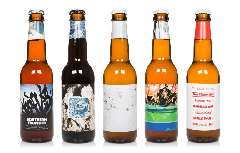
I work a lot with photography and typography. I don’t necessarily think that these are especially suited for a beer brand but they are areas in which I take great interest. It is a part of my language as a designer. My conceptual approach to these two areas of visual communications seems uncommon within the world of beer branding and makes To Øl somewhat unique. This does not mean that To Øl is necessarily better than more traditional brands – it’s just different. It offers a different view on graphic design and branding. It seems that some people get it and others don’t. This is the great strength of the To Øl brand: The goal is not to satisfy everybody but to try out new ways of doing things and perhaps create something that is actually interesting.
Your work seems to make use of typography and colours not typical for beer companies. Is this an attempt to stand apart from other breweries?
It has almost become the trademark now but it was not a very conscious strategy when we started out. Because of the great amount of creative freedom I have been granted, I have mainly designed things the way I personally like them. My main interests are architecture, design and fine art – not the world of craft beer or fine dining even though I find them intriguing. So it felt very natural drawing inspiration from the areas that I cherish the most. I guess this makes To Øl’s designs stand out together with the fact that I have never looked to traditional beer brands for inspiration. It is also very thrilling to introduce a way of thinking from one area into an other. Hopefully To Øl can open up the arts to a new audience.
Have you any favourite designs you’ve done for To Øl?
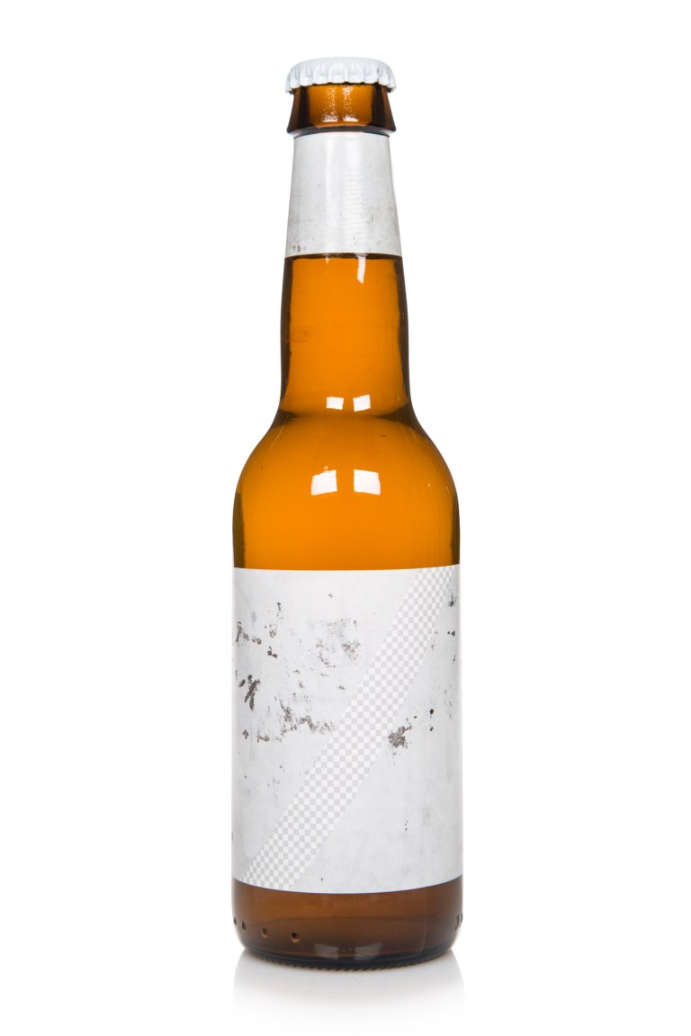
LikeWiesse
The label consists of a photo of an attempt to remove graffiti by painting it in a slightly different colour than the original, thereby creating a new and subtle visual expression. On top of this image is a diagonal line which is masking a transparency pattern known from applications like Photoshop where it is used to illustrate emptiness. In a culture defined by a constant flow of loud images this label is barely whispering.
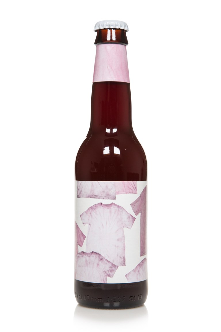
Berry White
The label is made of photos of t-shirts coloured with the berries used to brew the beer. Berries dissolved in water is not a very good colorant. The t-shirts appears light pink and seems like their prime days are long gone.
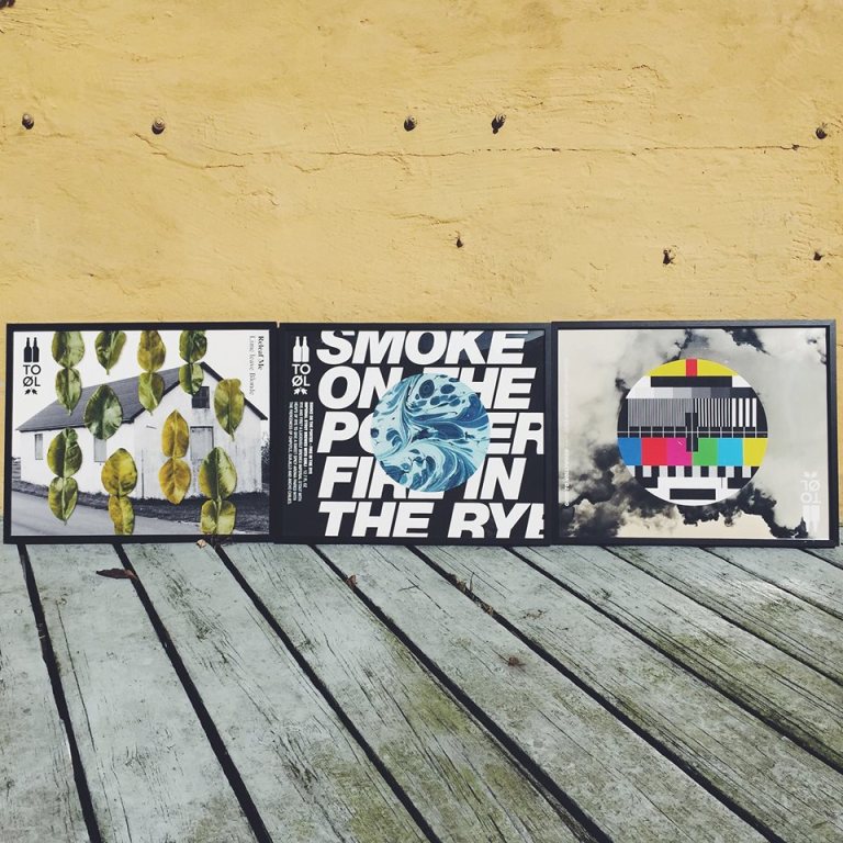
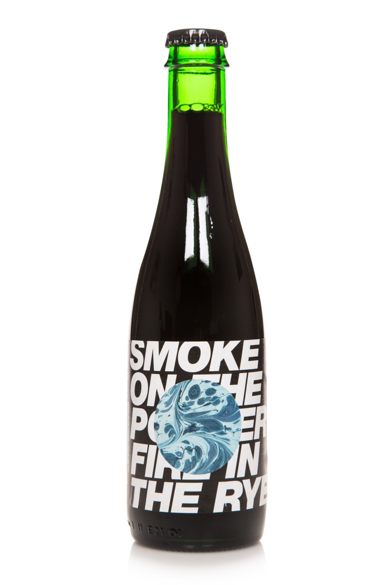
Smoke on the Porter
Large type is contrasting against a circle masking a psychedelic pattern partly obscuring the text. The label questions the necessity for legibility and ask the basic question: Does an image say more than a thousand words?
Eurodancer
An American wheat ale called Eurodancer featuring the stars of the European flag and a pentagram. What’s not to like? The label has arguably gained new meaning with the recent political turmoil in the EU.

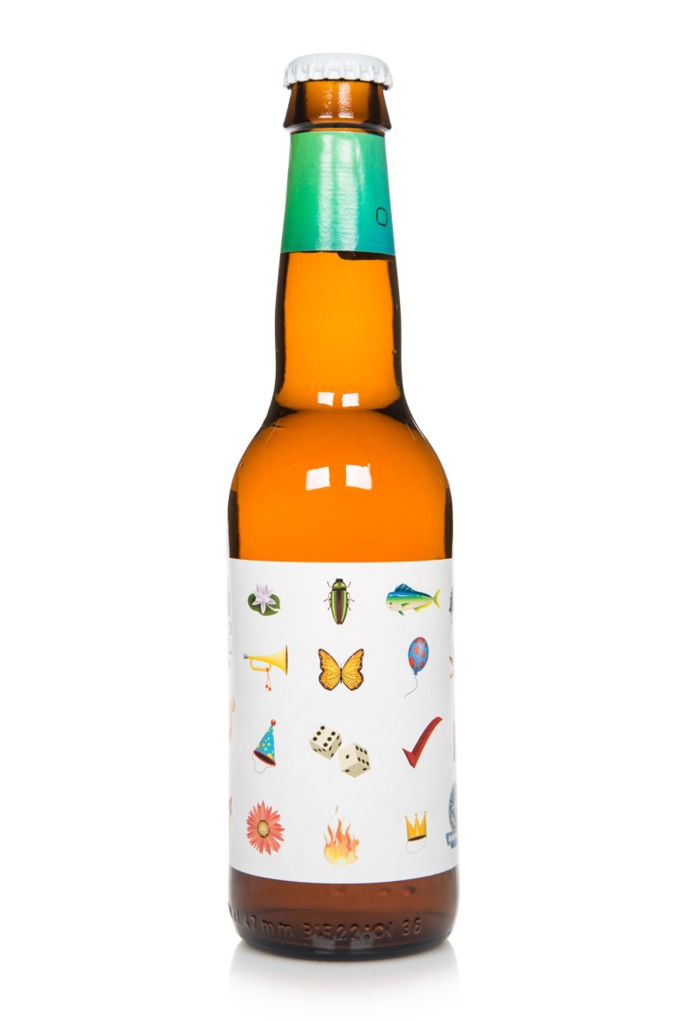
Total Hybris
A selection of standard clipart from Adobe Illustrator. The various illustrations is organized into a grid and is suggesting some kind of deeper meaning or order that is or isn’t there. It’s a kind of anthropological survey into the weird world of clip art.
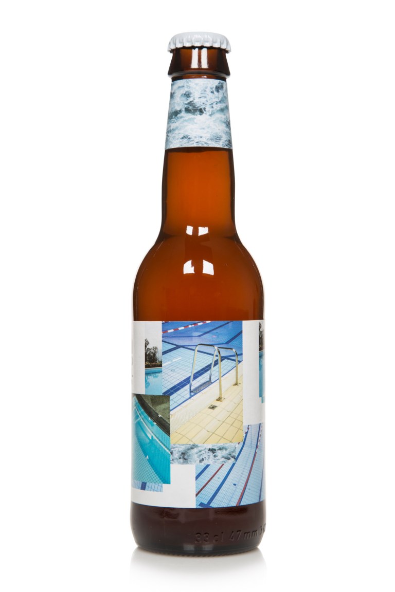
Yeastus Christus
The label consists of various photos of public swimming pools. I really like the still water of an unoccupied pool. It’sspatial properties are quite unique. I like how the blue colour of the bottom makes it all seem artificial, made to resample the western idea of a tropical paradise. The swimming pool is a quite political space.
Was it a conscious decision to have an unconventional approach when designing To Øls branding?
As mentioned before it was not a very conscious strategy when we started out. To Øls brand wasn’t designed at once but is constantly evolving. Since the open attitude seemed to be an interesting approach I have tried to take it further and not turn to more classic beer aesthetics. I don’t think that I have found the perfect formula and that probably doesn’t exist either. Each label is a negotiation of what a beer can look like just as each beer is a negotiation of what a beer can taste like.
How has working for To Øl changed over time?
Obviously the company has grown a lot. In the beginning I probably worked on To Øl related stuff once every second month – and now I’m almost working with them full time. We started out with no office, then moved to an old kiosk and now we are occupying af rather large office space just like several co-workers have joined the team. Of course our brew pub BRUS also opened earlier this year. Since the design of To Øl is in constant development I have learned a lot during the life of To Øl. The great amount of creative freedom also enables me to experiment and discover new ideas, concepts and techniques. My work for To Øl completely intervenes with my personal work. Sometimes an image shot on a vacation ends up on a label. Other times a concept developed at To Øl is explored further in my personal praxis and maybe ends up as an independent artwork.
How important do you think branding is these days to the success of a craft brewery?
First and foremost you got to have a good product. Some years ago I attended a lecture with the creative director of Wolff Olins (large british branding firm). He told how they once had to rebrand a phone company and ended up reimagining all their products. His point was that you can not make good branding with bad products. This very much applies to craft breweries. I consider most of To Øl’s design to be part of the actual experience and not just marketing. I have never subscribed to the idea of considering form and content as different replaceable parts. They are completely intervened. They are actually the same. If you are dining at a Michelin star restaurant and the dish looks like shit but tastes nice it will of course ruin your experience. So to have a good product you also need to have good design. Good should not be mistaken with beautiful design. Good design is often what makes us question our understanding of the beautiful.
To Øl is famous for it’s unique and innovative beers, do you feel the design has to try and compliment or highlight the beer?
Yes, definitely. I don’t think it has to be a direct illustration of the beer. Like drawing a barrel and cherry on a Barrel aged cherry porter. Beer is an abstract experience a lot like music. You are trying to convey something hard to describe with words. Drinking a beer is much about feelings. The taste, the texture, the carbonation all makes you feel something and might bring back old memories. The alcohol kicks in and the experience gets saturated. Hopefully the visuals can be a part of this process and maybe enlarge it.
Do you have any favourite artists or designers?
There is a lot but I will just name a few.
Peter Saville (New Order’ and Joy Division’s graphic designer). When i discovered the work of Saville I realised that graphic design could be about feelings and not just communication.
Jørn Utzon (Architect, Sydney Opera House). Utzon’s work is both humanistic, subversive and really strange. I never completely understand his buildings and that is a great strength.
Experimental Jetset (Dutch graphic design trio). They showed the way for a critical and reflective debate about graphic design. Their work is for the most part hardcore typographical and quite beautiful both visually and conceptually.
Per Kirkeby (Danish painter and sculpture). Public Denmark is pretty much decorated by this guy (together with Poul Gernes). First I really disliked Kirkbys bricks sculptures and abstract paintings. Now i love them. I guess I can’t escape my upbringing. It is scandinavian darkness in its purest form.
Ettore Sottsass (Italian architect and furniture designer). There is so much boring furniture – none of it is designed by Sottsass. He managed to re-innovate himself all the time, even in his sixties when he was the leader of Memphis (Italian furniture design group). His way of working in-house with a big corporation (Olivetti) was also inspiring.
Hans-Ulrich Obrist (Swiss curator). Obrist is not an artist or designer but a curator. His ideas about curation as a way for the involved artists to realise their potential can easily be used on art direction.

Do you have a favourite To Øl beer?
Sort Mælk, so uncompromising.
Any other breweries you’re excited about? Either design or beer?
Both Mikkeller and Omnipollo has some nice design going. Each having their own approach.
I grew up just five meters from Carlsberg, there was literally five meters from the backyard door of my childhood home to the site of their Copenhagen breweries and headquarters. Their logo on the grain silos illuminating the night sky. The distinct smell that could be quite powerful. Carlsberg will always have a special place in my heart even though I realised they make really boring beers.
Do you ever collaborate with other artists on your work?
I have done a few collaborations with Keith Shore on To Øl / Mikkeller collab beers. For BRUS we were several creatives collaborating.
What are the plans with To Øl for the future?
It is hard to say. Hopefully something unexpected even to our selves.
Cheers Kasper, anything else you’d like to add?
The Fiat Multipla is one of the most ugly cars ever designed but also one of the most interesting. That pretty much sums up my view on design.
Instagram: @kasperledet @emptiesblog